

Key Takeaways
- Scale contrast is the single most reliable tool for mixing patterns successfully.
- A shared color between two prints creates visual cohesion even when patterns differ dramatically.
- Texture mixing follows similar rules to pattern mixing but is generally more forgiving.
- Anchor busy combinations with at least one solid or neutral element to give the eye a resting point.
- Understanding what breaks a combination helps you identify what makes one work.
Why Pattern Mixing Feels Risky — And Why It Doesn't Have to Be
For many people, combining a striped shirt with a floral skirt feels like a gamble. The anxiety is understandable: pattern mixing has a high visual ceiling, but the gap between "intentional" and "chaotic" can seem impossibly narrow. The good news is that gap is actually governed by a small set of principles — not instinct, not innate taste, and definitely not a large budget.
Understanding those principles means you can make deliberate choices rather than guessing. It also means you can look at an outfit that isn't working and diagnose why, which is arguably more useful than knowing what works by accident. For a broader foundation on building outfits around what you already own, see how intentional styling differs from simply owning more.
Start With What You Already Own
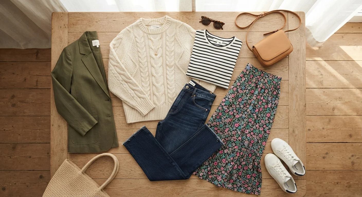
Before buying new pieces to experiment with pattern mixing, audit what's already in your closet. Many wardrobes contain untested pairings that work perfectly — they've simply never been tried. Lay candidates flat side by side to assess scale and color relationships before committing to an outfit.
The Core Principles That Make Combinations Work
There are three primary variables to manage when mixing patterns: scale, color, and visual weight. Get at least two of these working in your favor, and most combinations land well.
Vary scale deliberately — pair one large-scale pattern with one small-scale pattern.
When two patterns occupy different size registers, the eye naturally reads one as background and one as foreground. This hierarchy prevents the visual competition that makes combinations feel chaotic. Same-scale patterns demand equal attention and create tension without resolution.
Use a shared color as the connective thread between two different prints.
Color is the fastest signal the eye uses to judge whether elements belong together. Even a single shared hue — pulled from the background of one pattern and the foreground of another — creates a sense of intentionality that overrides pattern differences.
Include at least one solid or neutral element when combining two strong prints.
Every busy combination benefits from a visual pause — a place where the eye can rest before returning to the pattern. Solids in a neutral pulled from both prints serve as a bridge and prevent outfit-wide visual fatigue.
Match visual weight across both patterns to avoid one element overwhelming the other.
Visual weight refers to how much attention a pattern commands — dense, dark, or high-contrast patterns carry more weight. When one pattern is significantly heavier than another, the lighter one disappears rather than contributing to the combination.
Limit active mixing to two pattern types; let texture introduce the third layer.
Three competing prints in one outfit exponentially increases the number of relationships the eye must resolve simultaneously. Substituting a textural contrast — a woven, a knit, a smooth finish — adds dimension without the same cognitive load as a third print.
Texture follows similar logic. Pairing a chunky cable-knit with a sleek satin skirt works because the contrast is deliberate and the textures don't compete for the same visual register. For context on how fabric construction affects how pieces behave together, this breakdown of natural versus synthetic fabrics is a useful reference.
When Mixing Breaks Down
Most pattern-mixing mistakes share a common root: too many elements competing at the same scale and intensity with no unifying thread. A medium-scale floral and a medium-scale geometric in clashing colorways will always feel restless, regardless of how individually interesting each piece is.
2–3
Pattern types before combinations typically break down
Style educators consistently observe that limiting active prints to two or three distinct types keeps an outfit readable and intentional, regardless of formality level.
1 shared hue
Minimum color link needed for pattern cohesion
A single color appearing across two otherwise unrelated prints is widely recognized by stylists as the baseline requirement for a combination to read as deliberate.
Another common pitfall is ignoring visual weight. A dense, dark tartan and a high-contrast graphic print worn together create visual noise because both demand attention simultaneously. Introducing a solid — even a scarf or a belt in a neutral pulled from both patterns — often resolves the tension immediately.
Color is the quietest connector. When two very different prints share even one color, the eye reads the combination as intentional. This is why understanding basic color relationships pays dividends far beyond solid-color outfits.
Putting It Into Practice
The easiest entry point for pattern mixing is a two-piece outfit where one pattern is small and low-contrast (a fine pinstripe, a tiny ditsy floral) and the other is larger and bolder. The small pattern recedes, the large pattern leads, and the combination reads as considered rather than cluttered.
Texture mixing is an excellent lower-stakes starting point if prints feel overwhelming. A linen blazer over a ribbed cotton tee, or a velvet top with denim, creates dimension without the visual complexity of competing prints. As your eye develops, you'll find the same spatial logic applies to both. For grounding all of this in pieces that actually carry the weight of daily wear, explore the clothing items that make mixing strategies more viable.
This article is for informational and educational purposes only. Style guidance reflects general principles and may not suit every individual preference, body type, or context.