

Key Takeaways
- You don't need to memorize a color wheel — a few simple frameworks handle most everyday outfits.
- Neutral anchors paired with one intentional color are the foundation of most well-coordinated looks.
- Tone and saturation matter as much as hue when mixing colors that appear harmonious together.
- Building outfits around a consistent value (light, mid, dark) creates cohesion without effort.
- Repeating one color in two places in an outfit creates a polished, pulled-together effect.
Why Color Feels So Complicated
Most of us learned about color through art class color wheels — complementary pairs, triadic schemes, warm versus cool tones. That framework is useful in theory but rarely translates cleanly to getting dressed in the morning. Real clothing comes in complex, nuanced shades: a navy that reads purple in certain light, a beige that leans pink depending on what it's next to. No wonder color coordination feels intimidating.
The good news is that confident color dressing doesn't require memorizing theory. It requires learning a handful of principles that reflect how colors actually behave when worn together — on real bodies, in real lighting, across real wardrobes. These principles work across budgets, body types, and personal style preferences.
If you've ever felt like your closet is full but your outfits aren't working, the issue often isn't a lack of clothing — it's a lack of a cohesion framework. Our guide to versatile wardrobe thinking addresses that broader challenge, and color coordination is a key part of unlocking it.
Proven Practices for Mixing Colors with Confidence
The following practices are grounded in how color behaves in everyday styling contexts — not in rigid rules, but in patterns that consistently produce results.
Anchor every outfit in at least one true neutral.
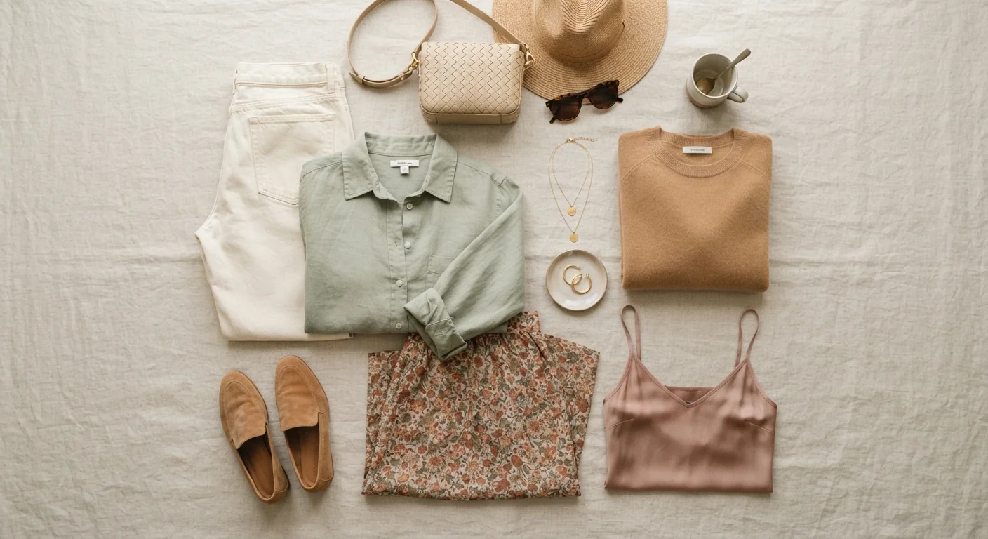
Neutrals — white, black, gray, navy, camel, cream — act as visual resting points that allow other colors to be read clearly. Without a neutral anchor, multiple colors compete for attention and the overall look feels busy rather than intentional. Neutrals also tend to be the most versatile pieces in any wardrobe.
Match tones, not just hues — pair warm with warm, cool with cool.
Two colors can look clashing not because they're different hues, but because one leans warm (yellow or red undertones) and the other leans cool (blue or green undertones). Aligning the temperature of your colors creates visual cohesion even when the hues are quite different from each other.
Use value contrast (light versus dark) deliberately to create structure.
Value — how light or dark a color is — is one of the most powerful tools in outfit building. High-contrast combinations (light top, dark bottom) feel graphic and sharp. Low-contrast combinations (similar values throughout) feel understated and cohesive. Choosing your contrast level intentionally shapes the overall impression of an outfit.
Repeat one color in at least two places in an outfit.
Repetition is one of the fastest ways to make an outfit look considered rather than random. When a color appears more than once — even in a small detail like a bag, belt, or earring — the eye reads it as a deliberate choice, which creates a feeling of polish and intention.
Limit active colors to two per outfit when in doubt.
More colors require more coordination skill to balance. Keeping active (non-neutral) colors to two per outfit dramatically reduces the chance of visual conflict and makes getting dressed faster. As your eye develops, adding a third becomes easier — but two is a reliable starting point for most occasions.
Once you have these principles in place, you'll also find that pattern mixing becomes far less daunting. For more on that topic, see our piece on when mixing prints and textures works.
Quick Moves You Can Make Right Now
You don't need to overhaul your wardrobe to start dressing with better color coordination. Small adjustments — even within your existing closet — can make an immediate difference.
Color Rules Are Starting Points, Not Laws
Every principle in this guide reflects patterns that work reliably for most people in most contexts — not rigid rules with no exceptions. Personal coloring (skin tone, hair, eye color) affects how colors read on your specific body. Trust your own eye: if a combination looks right to you in good lighting, it almost certainly is. These frameworks are tools, not mandates.
Color coordination is also closely tied to how well your pieces work together across seasons. Our seasonal wardrobe guide shows how a consistent color palette extends the usefulness of every piece you own.
Building a Color-Coherent Wardrobe Over Time
The most effortlessly coordinated wardrobes aren't built by shopping color-consciously once — they evolve through intentional, gradual decisions. When every piece you add is evaluated against what you already own, color harmony becomes a byproduct of thoughtful curation rather than a separate project.
A practical starting point: identify your two or three most-worn neutrals and two accent colors you consistently reach for. Use those as a filter when considering new additions. Pieces that fall outside that palette require more deliberate styling; pieces within it slot in automatically.
~10
Pieces needed for a functional capsule wardrobe
Fashion educators and stylists widely suggest that a core wardrobe of around ten versatile pieces in a cohesive color palette can generate dozens of distinct outfits.
3–5
Accent colors typical in a cohesive wardrobe palette
Style professionals generally recommend anchoring a functional wardrobe around two to three neutrals and no more than three to five repeating accent colors for maximum mix-and-match flexibility.
For a deeper look at which foundational pieces tend to support the most color combinations naturally, explore our guide to wardrobe anchor pieces. The principles of color coordination and versatile dressing reinforce each other — once you see how they intersect, both feel significantly more manageable.
This article is for general informational and educational purposes only. Style guidance reflects general principles and may not suit every individual's preferences, body type, or circumstances.